Coolie Data Viz

Exploring the Coolie Trade of the 19th Century using data visualization.

Conclusions (Thus Far...)

As the due date for my Honors Project is upcoming, I thought it appropriate to make a post that offers some thoughts or tentative conclusions on this project thus far. These include what I have learned about conducting digital history and using data visualizations, the opportunities and pitfalls present in such an approach, and what can be done in the future (in this project and others like it) to remedy limitations in approach and design.

I am hesitant to term these thoughts “conclusions” because the word suggests that the project has a definite end. Due to the exploratory nature of any investigative project, however, these projects only have an end insofar as the researcher stops asking questions of the data found. Additionally, the nature of the Web as ever-expanding lends an additional bulwark against this project ending. In some ways, it is easier to come back to the models on this website and the data underlying them to add on further findings or thoughts than it is to expand a long-form, traditional research paper that is bogged down by the need to maintain a continuity of style and writing for cohesiveness.

One dimension of this project that has surprised me is frankly the abundance of “low hanging fruit”, so to speak, within digital history. There are so many topics that, while receiving ample treatment within traditional historical analyses, have not been approached from a digital history perspective. This is partially due to the field being relatively new, but also because of the perceived limited audience of such efforts. If a historian wants to take the data they have gathered and create digital models based on such data, it could be perceived as too niche or not worth their time given that it might only serve a public historical function, rather than aiding their research. On the other side of the spectrum, public historians might be hesitant to use data-centric models due to a fear that viewers will not be drawn in.

What historians of all stripes must come to understand in the coming years is 1) the relative ease with which they can digitize and model their data with a variety of 3rd party tools and that 2) there is utility in these models that applies to both the historian as well as the public. Data visualization has the power to reveal what was previously unseen or perhaps overlooked in traditional approaches to historical analysis. It can be used to direct research towards answering a specific question, as a previous post illustrated; and if unable to fully answer such a question it at least giving evidence of one more tool used by the historian in conducting her due diligence. For public historians, data visualization models, when made compelling through design and clarity, can capture the viewer's attention more immediately and convey information more readily than other digital (or non-digital) communication mediums. Data visualization and digital history, as I have found, are an essential tool for the 21st century historian, another feather in her cap.

My categorizing of data visualization and digital history as a “tool” for historians reflects my belief that it is not a historian's panacea. Data-driven history cannot become disengaged from the historical narrative that lends relatable stories and human experiences to people’s understanding of history. In the case of the Coolie Trade, one has to do the dual legwork of presenting digital models within a larger context focusing on the historical phenomenon itself. In other historical periods that are better known, this might be unnecessary or less important to do, but for a period of history that few people know about, any attempt at digital history must bring with it a larger narrative, especially if aimed at a popular audience.

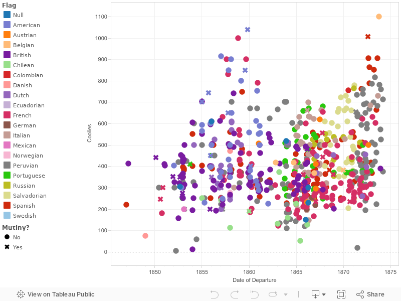
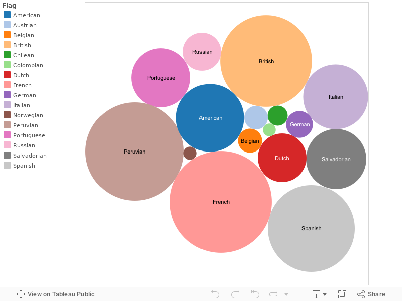
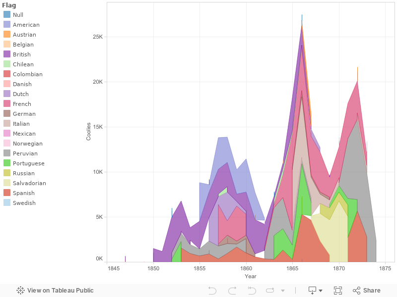
In terms of this project’s limitations or shortcomings, the accuracy of the models is necessarily limited by the accuracy of the data itself. This is the case for any kind of data visualization model, but is especially important to keep in mind when dealing with data sets pulling from 19th century records. For example, the models on the site excluded those ships that did not have information on the number of coolies being transported, and the data set more than likely is missing ships that transported coolies since much of the trade was illicit. If we had a perfect data set, the results of the models could be different. That is not to say that the conclusions being made from the models would be invalidated. More than likely the "big-picture" takeaway from the models would be maintained. Nonetheless, we must always remember that the conclusions drawn from the models must be used as a starting point for further investigation rather than being the last word.

In terms of my previous experiences conducting historical research throughout my undergraduate career, this project and the work required to bring it to fruition has been entirely new and refreshing. Thinking about conveying historical information in a visual and succinct manner, while tapping into skills used in writing good history, is something that students of history are seldom asked to do. The time-honored practice of writing lengthy research papers, while important and necessary in academia, seems to be over emphasized and beaten to death, much to the detriment of new mediums for conveying history like those used in this project. There is little doubt in my mind that other historians, whether they are in undergraduate or graduate programs, should be exposed to writing and conducting history within this new and innovative framework that the Web and data visualization tools have made possible. This framework holds great promise for students of any historical topic and helps to make history more relevant in the digital age.

As I mentioned at the beginning of this post, this is certainly not the end of this project, nor have we reached the limit of what data visualization can offer us in analyzing the Coolie Trade. Further exploration of the Coolie Trade could be done using the Cuba Commission Report, which lends itself well to data-driven analysis because of the statistics underlying the aggregated testimonies of Coolie laborers and the possibilities for finding commonalities or differences among the various testimonies that may not be evident without digital parsing to search for patterns. Since the document details the abuses suffered by the Coolie laborers, making the Cuba Commission Report digitally "parsable" would be a significant step forward in uniting traditional historical narrative and data-centric history and could offer new insights into the experiences of these laborers. It is my hope that this project will continue to bring attention to the history of the Coolie Trade through the use of data visualization.

The Pitfall (and Advantages) of Data-Centric History

The Pitfall

In doing this project, I have begun to think about the implications of conducting what might be called "data-centric" history on a historical period that contains within it so much tangible human suffering and death. It might be uncontroversial to do data-centric historical work on the history of the New Deal, but when the history deals with events that directly led to the death and enslavement of hundreds of thousands of powerless laborers, data-centric history runs the risk of dehumanizing the phenomenon and hiding human experiences and tragedies behind data points.

Nonetheless, the data visualizations in this project provide important information about the history of the Coolie Trade. How can we balance the obvious value of data without falling into the impersonal abyss of numbers and "chartjunk"? 

Contextualize

If we are going to give visuals on the Coolie Trade or any other historical phenomenon, we must contextualize the data and provide background on the human dimension of these events. This is necessary not just for people to understand the visualizations, but also for them to understand the significance of the history beyond the data. In the historical community, there have been dozens of works written that detail the abuses and suffering of coolies throughout their journey in the Trade, but seldom is this information presented in a visual manner. Thus, in "doing" digital history, one cannot leverage the data without bringing the historical narrative that serves as the foundation to "meaningful" data. The reader must be aware that there is a story behind each data point, some ending in the death of hundreds of coolies. That is what I have attempted to do with the visuals (images) on this website, in addition to the brief explanation of the Coolie Trade. These two components help to balance the cold hard visuals with a reminder of what the individuals who participated in the Coolie Trade looked like and went through.

Advantages

But as I stated before, there is an advantage to leveraging data-centric history. In looking at the data in visually unique ways, we can come to different understandings and have new insights into the history that would not be immediately (and intuitively) visible in the written record. Additionally, data and data visualizations can make the "takeaway" more evident. By seeing these visualizations that deal with multiple Chinese ports, multiple destinations, and multiple Western nations involved, one intuitively grasps the global nature of the Coolie Trade. More typical narratives that might focus on the story of one laborer can tell that global story, but not in its entirety and not in a concise manner. 

Additionally, data can be easily utilized in comparative studies that span very different time periods. While traditional historical narratives become restricted by the setting of its time period (i.e. a 19th Century Cuban plantation), data transcends such restrictions and allows immediate comparisons between temporally different but thematically consistent trends in history. For example, a comparison between the Coolie Trade and other transnational migrations, like the African Slave Trade, the Jewish diaspora, or the modern trafficking of sex slaves is much easier to do with the data from each respective migration than with the individual narratives of those who lived through the migrations. Such data-driven comparisons, while missing that all-important historical narrative, can tell us important information about the nature of involuntary migrations, how they have changed and remained consistent, and can provide a foundation for qualitative study that could corroborate the data or guide further data-driven analysis.

Overall, I would argue that we cannot dispense with the personal historical narrative or histories that focus on the experiences of people who lived through the events of the past. Data can give us a better understanding of the grander scheme of the events and can even cause us to dig further into those parts that were previously unknown or unexplored, but it must be accompanied by context that gives the reader the fullest understanding of what they are looking at.

"Doing" Digital History

Throughout this project, I have been thinking about the implications of my work and digital history at-large on the historical field. What can this project bring to the table, in terms of both the treatment of the Coolie Trade by historians thus far as well as in terms of what role digital history can play in contributing to the historical profession and maybe more importantly, outside academia. 

A definition of digital history may be useful in weighing the goals and efficacy of this project. This definition from the AHA and William G. Thomas III frames the topic in a very comprehensive manner:

Digital history might be understood broadly as an approach to examining and representing the past that works with the new communication technologies of the computer, the internet network, and software systems. On one level, digital history is an open arena of scholarly production and communication, encompassing the development of new course materials and scholarly data collection efforts. On another level, digital history is a methodological approach framed by the hypertextual power of these technologies to make, define, query, and annotate associations in the human record of the past. To do digital history, then, is to digitize the past certainly, but it is much more than that. It is to create a framework through the technology for people to experience, read, and follow an argument about a major historical problem. (Source)

Within this definition, there is one point that I feel most closely relates to what I am working towards in this project. The "hypertextual power" to "make, define, query, and annotate associations" is, in my mind, the greatest strength of the new digital landscape as it relates to conveying history in a new manner.

There is a obvious need to provide history in a manner that is accessible without lowering the quality of the information historians have gathered and interpreted. While traditional approaches to history that are defined by long-form research articles or monographs are entirely necessary and will most likely remain the bedrock of the profession, there is a serious need for the profession to recognize the contributions of non-traditional methodologies that can yield important, albeit different in nature, insights.

In my project, the intent has been to make and annotate those "associations" referenced by Thomas. By bringing the data of the Coolie Trade into a public and digital setting, one can present this information in models that would be wholly impossible or at least not nearly as powerful in their reach and dynamism if they were left in their original form either as raw data or simple, static visuals. Historians and laypeople can both get meaningful knowledge from the data represented in a visual manner. For the historian, they may see a trend or anomaly that sparks further research. For the layperson, they may learn about a historical phenomenon that was previously unknown to them, either because of a lack of information available publicly or due to the way that information was presented previously (e.g. in a scholarly article rather than visuals on a website).

tl;dr Digital History adds an alternate manner of understanding and representing historical research that is sorely needed given the status quo of what is termed "authoritative" within the profession. It has the power to expand the audience of historical scholarship beyond the profession itself and engage the public more fully.

Using Data Viz to Answer a Historical Question (Updated!)

While the data visualization models on this site are nice to look at and certainly can show people complex statistical information in a more visually appealing way, the true value of these models insofar as they contribute to the historical venture is twofold:


  1. Can they help to show us anomalies or changes in the data that have a basis in the historical record?
  2. Can they help to explain such anomalies or at least bring us closer to possible reasons why such changes are the case?


As an example to illustrate this point and see if it has merit, we can see in the following model that there is a significant drop in the volume of coolies being transported between 1858 and 1862. 1862 represents the lowest volume of any year, despite it being right in the middle of the trade's development and coming immediately before a huge surge in the coolie trade in the following decade.


So how do we explain this decline in the trade?

Since the data we have can only explain so much, it is beneficial to consider first those major historical events or circumstances that were occurring at the time and how they might fit into the picture:

  • Taiping Rebellion- This massive rebellion taking place between 1850-1864 was a major conflict in central China that caused huge demographic shifts as a result of the violence and conflict. However, the migrations that took place forced many Chinese to emigrate to the coastal provinces where the coolie trade was present, and as such helps to explain the rise of available coolie labor, not any shortage of it.
  • The 2nd Opium War- This Sino-Western conflict between 1857-60 led to the opening of more Chinese ports to Western merchants. The coolie trade's presence in Chinese ports was often bolstered by that of the opium trade, and therefore the war would help to explain the expansion of the trade, not any decline in the short term.

Since these major historical events don't seem to lend any explanation as to why the coolie trade declined between 1858-62, a closer look at the data itself is warranted. By drilling down the above model by the port of departure, a more complete picture of the coolie trade overall becomes available:

Click to expand

In this bar chart, each year's volume is broken down by the ports of departure in China. With this breakdown, it is easier to see several pieces of information:

  • The consistent dominance of Macao over all other ports in terms of volume
  • The decline of Swatow and Amoy as ports of departure following 1858 (and Cumsingmoon's decline earlier)
  • The rise of Canton and Hong Kong as ports of departure following 1858

Swatow, Amoy, and Cumsingmoon became less popular ports for transporting coolies due to the unregulated nature of these emigration stations and their close connections with the opium trade that was being conducted from these clandestine stations. According to Arnold Meagher, opium houses pressured their officials on the ground to move their actions to legal ports, and so emigration traffic that was closely associated with the opium trade went with them, helping to explain the rise in Canton and Hong Kong as ports for the coolie trade. (Meagher, 101)

What is not explained in this chart, or in the historical record from what I have been able to find, is why the volume of coolies transported out of Macao dropped precipitously in 1861 and 1862. These two years are anomalies in comparison to the steep rise in the coolie volume in the subsequent years, which resulted from the increased regulations on the coolie trade implemented by the British and Chinese in those ports under their control which caused coolie traders to increasingly relocate their activities to Macao.

One final visualization may aid us is narrowing our focus further. The following visualization is a variation of the previous one, in which coolie trade volume is broken down by the destination:

Click to expand

In this model, it becomes clear that the decline in coolie volume from 1858-1862 primarily impacted those ships destined for Cuba. In fact, despite the rise in ships going to British Guiana and Peru, volume overall decreased. Thus, we can also look to the situation in Cuba between 1858-62 to help explain the decline in coolies being transported.

Thus, supply (in Macao) and demand (in Cuba) become the two factors potentially driving the decline in these years.

Given that we have not been able to fully answer the question raised by the data, we can say that the data can never fully explain the various historical events and processes underlying it. However, without such visualizations, the question may not have been asked or framed in a way that would lead the historian to focus on the Macao trade between 1861-62 or the situation in Cuba specifically. Data and data visualizations, for the historian, can be incredibly useful tools that complement more traditional forms of "doing" history.

UPDATE: After further research as part of my senior History thesis, I have found a potential explanation for the drop in coolie volume between 1861-62. These years coincided with serious efforts by Lao Chonguang, Governor-General of Guangdong, to eliminate the illicit coolie trade in ports like Whampoa and Swatow. Much of the French activity in these areas actually involved capturing coolies in those ports and shipping them to Macao for further transport to the New World. As such, an impact in the number of coolies captured in Whampoa and Swatow would have an impact on the number of coolies shipped out of Macao. This historical nuance is not visible in the data, which highlights the complex nature of coolie recruitment due to the various international actors involved. It also speaks to the limitations in data to illustrate these nuances.


Sources:

MEAGHER, A. J. (1975). THE INTRODUCTION OF CHINESE LABORERS TO LATIN AMERICA: THE “COOLIE TRADE,” 1847-1874. ProQuest Dissertations Publishing.

Coolie Ship Scatter Plot

This scatter plot shows all of the (documenteD) ships that transported coolies to Latin America during the Coolie Trade. Each ship is represented by a data point, which is color coded by the flag the ship flew. Those ships that experienced mutinies are shaped differently. The ship's position on the y axis is based on the number of coolies it was transporting.

Those ships that did not have information on the number of coolies they were transporting have been excluded. Those ships that did not provide a specific month for their departure have been set to January 1 of their respective year.

Additional information on each ship, including its name, the flag it flew, the year it sailed, the number of coolie it transported, and its mutiny status is available when hovering over each data point.


Raw data from Meagher, Arnold J. 2008. The Coolie Trade : The Traffic in Chinese Laborers to Latin America, 1847-1874. Xlibris Corporation.

Coolie Volume Packed Bubble

This is a visual, created with Tableau Public, showing the breakdown of coolies transported by nation (or the flag that the ship flew).

An interesting takeaway from this visualization is the fact that so many different nations contributed to the transport of coolie laborers to relatively few destination countries (primarily Cuba and Peru). The fact that the transport of coolies was distributed among different countries made it difficult for the Chinese government to regulate and end the trade. For example, after drafting regulations known as the Peking Regulations of 1866, which dealt with how coolies could be transported and treated in their destination countries, the Chinese government was successful in getting several countries, including the US, Germany, and Russia, to adopt the regulations. However, they failed to get Spain, Britain, and France to adopt the regulations. As one can see from the visualization below, failing to secure these three nations' agreement meant leaving out a significant slice of coolie traffic that would continue to be relatively unregulated.

Visualizations like this one can help to frame the efficacy of certain laws or regulations passed by the Chinese government at the time. Due to the various international players in the Coolie Trade, breakdowns on the data like the one below are critical to framing the history accurately.

Raw data from Meagher, Arnold J. 2008. The Coolie Trade : The Traffic in Chinese Laborers to Latin America, 1847-1874. Xlibris Corporation.

Coolie Volume by Year/Nation

This model shows the composition of coolies shipped by the flag the ship flew and by the number of coolies being transported. This helps to show the increase in volume of the Coolie Trade and the changing composition of those nations involved in the trade.

For example, by clicking on the American label on the Legend, it becomes clear that American involvement in the Coolie Trade ended in 1862. In this year, the American Congress passed An act to prohibit the "coolie trade" by American citizens in American vessels, which prohibited the transport of coolies on any ships owned or operated by American citizens. Prior to the passage of this law, American ships had been heavily involved in the Coolie Trade, which was problematic for many Americans due to the parallels between the Coolie Trade and the African Slave Trade of the earlier half of the 19th Century. The full text of the 1862 Anti-Coolie Law can be found here.

Raw data from Meagher, Arnold J. 2008. The Coolie Trade : The Traffic in Chinese Laborers to Latin America, 1847-1874. Xlibris Corporation.

Coolie Emigration Flow

These "Alluvial Flow" models show the composition of the flow of coolie laborers from their chinese port of origin to their various destinations in latin america. the thickness of the lines indicate the number/volume of coolies transported.

The significance of these models is twofold.

  1. First, they shows that the vast majority of Chinese laborers were destined for Peru or Cuba.
  2. Second, they shows that the vast majority of those Chinese laborers transported were processed through the port of Macao, which was a Portuguese-controlled territory during the Coolie Trade and long after its demise.

Thus, these models help to visually explain why the Chinese government was so limited in its control over the trade, since so many coolies were transported out of ports that they did not have jurisdiction in. Canton and Hong Kong also fall under this category of ports outside direct Chinese control. These models also include less significant ports of departure and arrival and help to frame departure and arrival locations in terms of transportation volume side-by-side. 

410Brazil 0BrazilBritish Guiana 14,747British GuianaCosta Rica 685Costa RicaCuba 143,471CubaHondouras 480HondourasJamaica 515JamaicaMartinique 781MartiniquePanama 0PanamaPeru 104,913PeruSouth America 0South AmericaSurinam 2,861SurinamTrinidad 2,787Trinidad 0Amoy 11,323AmoyBatavia 270BataviaCanton 13,262CantonCumsingmoon 4,937CumsingmoonHong Kong 10,532Hong KongMacao 206,469MacaoNingpo 0NingpoPanama 205PanamaShanghai 855ShanghaiSingapore 0SingaporeSwatow 23,797Swatow

This second Alluvial model, while much busier and complex, maintains the relative clarity of the Port of Departure and Destination country's volume but causes the flow lines to pass through a 3rd variable (Year). This allows one to see the volume of each year relative to the total volume of coolies being transported. What is lost in this 3 dimension flow is the direct relationships between Port of Departure and Destination Country. The total volume leaving a Port and arriving in a country is preserved, but one can no longer determine the amount of coolies transported from Macao to Cuba, for example. But we can now see which years had the most transport volume and how each port of departure and destination contributed to the volume in a given year.

410Brazil 0BrazilBritish Guiana 14,747British GuianaCosta Rica 685Costa RicaCuba 143,471CubaHondouras 480HondourasJamaica 515JamaicaMartinique 781MartiniquePanama 0PanamaPeru 104,913PeruSouth America 0South AmericaSurinam 2,861SurinamTrinidad 2,787Trinidad 0Amoy 11,323AmoyBatavia 270BataviaCanton 13,262CantonCumsingmoon 4,937CumsingmoonHong Kong 10,532Hong KongMacao 206,469MacaoNingpo 0NingpoPanama 205PanamaShanghai 855ShanghaiSingapore 0SingaporeSwatow 23,797Swatow1847 63218471849 7518491850 1,46518501851 1,16518511852 5,96618521853 6,73718531854 3,80218541855 8,76018551856 9,16618561857 13,75718571858 13,83818581859 10,20018591860 11,42718601861 7,67318611862 4,83918621863 7,79018631864 11,31618641865 18,14718651866 27,45018661867 16,35518671868 12,65718681869 9,63618691870 13,82618701871 17,54918711872 21,63918721873 13,41218731874 2,3711874

Raw data from Meagher, Arnold J. 2008. The Coolie Trade : The Traffic in Chinese Laborers to Latin America, 1847-1874. Xlibris Corporation.